Customer-Facing Platform Revamp
This project, which is covered by a Non-Disclosure Agreement (NDA), restricts the sharing of detailed information and visuals. However, I can share an overview of my contributions, design approach, and the project's impact.
Client: Optum Timeline: 8 months Year: 2023
Role Overview
As part of the Optum UXD team in 2023, I focused on designing and delivering enterprise applications for Optum Behavioral Health, a multi-billion-dollar division within Optum. This platform served diverse users, including patients, providers, clinicians, and agents, and required robust, user-friendly solutions tailored to clinical and non-clinical needs.
Challenges
The project aimed to revamp an outdated system and deliver a modern platform. Key challenges included:
Stakeholder Alignment: Bridging the gap between business leaders and UX teams to align on design solutions and information architecture.
Complexity of Features: Simplifying navigation for users overwhelmed by redundant options and disconnected pathways.
Technology Constraints: Balancing innovative designs with the platform’s technical capabilities and project timelines.
Planning and Iterations

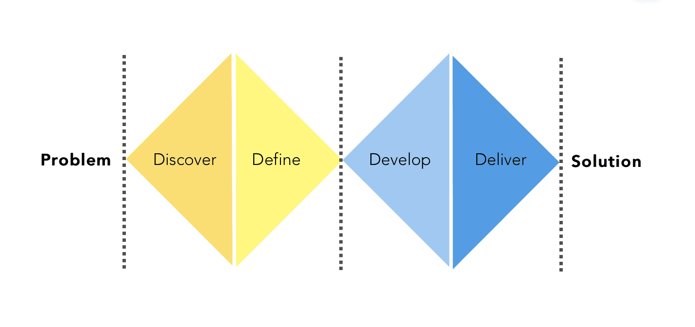
I utilized the Double Diamond framework to guide me in creating a design experience. This encompassed understanding customer needs, defining key issues, developing design ideas, and ultimately delivering the final product, which was launched in January 2024.
Conducted research using quarterly reports, user studies, and system constraints to identify opportunities.
Created user personas and journey maps to capture key pain points and moments of delight.
Iteratively refined designs through stakeholder presentations and A/B testing, incorporating business constraints and user feedback.
Presented design solutions to a large group of stakeholders and a group of Optum UXD folks.
Design Strategy - Get Care feature
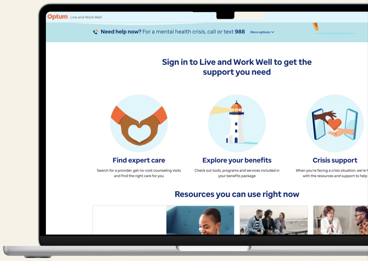
As part of the platform revamp, I was responsible for designing the Get Care feature, a key component of the Live and Work Well platform and a major touchpoint for visitors seeking care options. The design approach prioritized usability, efficiency, and personalization. The goal was to create an intuitive navigation system with consistent user experiences, enabling users to achieve their care goals seamlessly.
Key aspects included:
Streamlined Navigation:
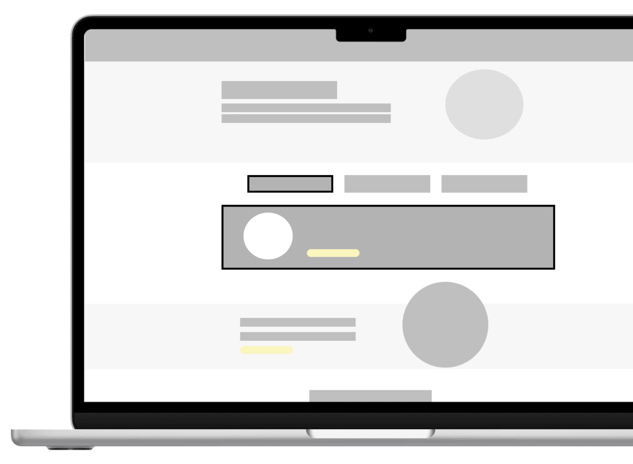
Introduced a central Get Care page to reduce the need for users to navigate through multiple disconnected pages.
Removed redundancies and highlighted relevant options at the right time using a tabbed layout.
Conducted heuristic evaluations to identify common usability issues.
Content Prioritization:
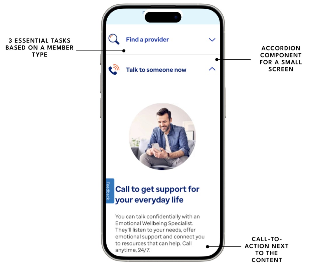
Implemented the Jobs-to-be-Done framework to curate high-priority tasks based on membership types and benefits.
Ensured essential information was presented upfront, helping users quickly identify covered care options.
Collaborative Iteration:
Developed wireframes and prototypes in Miro and Figma, refining designs through feedback loops with stakeholders and A/B testings.
Collaborated with content strategists to optimize task hierarchies and ensure clarity.
Worked closely with developers and product owners to validate feasibility and address technical constraints.

Solution: Enhanced Get Care Feature
The revamped Get Care feature addressed usability pain points by:
Consolidated care options into a single page using a tab component for intuitive navigation.
Organized care tasks into clearly labeled options, such as Get no-cost counseling, Find a provider, and Talk to someone now.
Presented actionable, personalized options aligned with users' membership types and covered benefits.

Impact
The redesign delivered measurable improvements:
Enhanced Usability: Simplified navigation reduced user confusion and improved task completion rates.
Efficiency: Streamlined pathways saved time, allowing users to achieve care goals faster.
Personalization: Tailored content aligned with individual memberships increased user satisfaction and engagement.
A/B Testing Results
As part of the iterative design process, we conducted A/B testing to evaluate the preexisting and redesigned versions of the Get Care feature. The objective was to assess whether users could:
Understand how to find their care needs effectively.
Learn about the different types of care options provided.
Key Findings included:
Improved Confidence: 87% of participants felt more confident using the redesigned Get Care page compared to the original version.
Enhanced Usefulness: Testers agreed that the redesigned top tasks section was particularly useful when seeking help.
Efficiency Gains: Users reported being able to locate care options more quickly, attributing this to the streamlined navigation and prioritized content.
Retrospective
The project was one of the most challenging yet rewarding experiences I’ve had. The limited timeline pushed the team to operate in a high-pressure environment where adaptability and collaboration became our most critical tools for success. I remained actively engaged with the multidisciplinary team, especially when newly added requirements had the potential to alter our design approach. I also worked closely with the developers to address technical or capacity challenges that arose. For instance, I had to reuse some existing components to accelerate the development process while ensuring that the solution complied with accessibility standard guidelines. Then, I rolled over building a new UI component to the next ongoing enhancement stage.
Testimonials
Sarah Tautin, Director, Optum Behavioral Health Content Strategy
"I had the privilege of working with Mara on a comprehensive and highly-complex site redesign executed within an aggressive timeframe. Despite lengthy requirements, long meetings and tight deadlines, Mara consistently turned around fresh, thoughtful designs quickly, iteratively, and collaboratively. She made everything look easy! What's more, she is a delightful, kind, funny and whip-smart colleague. I sincerely hope we have the opportunity to work together again, as she is an incredible asset to any team and every project."
Michael Phillips, UX Writer / Content Strategist
"Mara is a fantastic designer. I’m a content designer, UX writer, and Mara mega-fan. We worked together on multiple projects together at Optum from complex user flows with tricky stakeholder requirements to a redesign of our website’s main strategy and entry points. Mara was consistently curious, receptive, insightful, and productive. I would work with her again in a heartbeat."
Kate Hitchcock, Senior UX Designer at Optum
"Holy smokes, every now and then you come across a teammate who just blows expectations out of the water and DELIVERS! Mara is one such person. We brought Mara in to help deliver on a highly visible product with a seriously challenging timeline in complex space with an impact to millions of users. Mara showed a balance of curiosity, problem solving and tactical execution that outshines many people with more senior titles and I can truly say we could not have launched without her. Added to that, Mara is truly delightful human and partner to work with. I recommend her without hesitation."
© Created by Mara Suwannawat. 2024
